Don’t Tell Me – Show Me
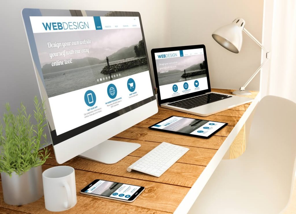
One of the simplest, but surprisingly overlooked ways of improving a website experience is to use larger images. There is no consensus as to how much text should appear on a page, but more often than not, websites don’t have enough images. After all, the web is a visual medium. A related mistake is adding images that are too small.
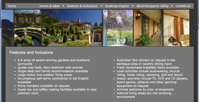
I recently needed to book some accommodation, but struggled to make a selection because all the websites had terrible photos, making it near on impossible to determine what was on offer. A simple photo gallery containing thumbnails that expanded to a large image when clicked would have been enough to secure my booking.
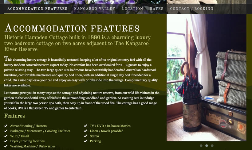
An important goal for a website is to get as close as practical to reproducing the experience that a visitor would get offline. Therefore strive to make your product/service as tangible as possible. This starts by including good quality and decent-sized images.
It’s a well used cliche, but a picture is worth 1000 words. But is that always true? Well, not if the picture is lousy. Bad photos can actually work against you. Despite the age of the web, people are still reluctant to buy online. Your job is to make it easy for them. Large, well lit photos are vital to securing the sale or getting more leads or making life easier for your audience.
BAD EXAMPLES
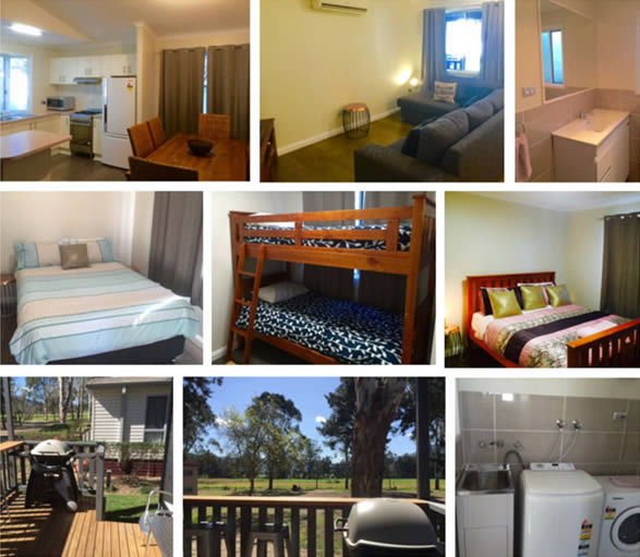
GOOD EXAMPLES


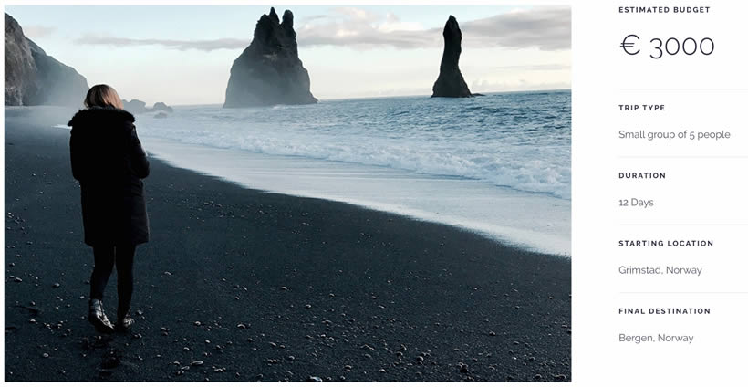
How many words is your picture worth?
Homework time: take a critical look at your website and ask yourself – “am I using images effectively to tell my story?” What can you do to improve your visuals? Can they be bigger, should you have more of them, would it be wise to hire a professional photographer?
Implementing tiny changes such as resizing your images can have a huge impact on your conversion rate. Has this article encouraged you to take action on your own site? Or would you like me to review your use of photos on your site? I’d love to hear your thoughts or questions in the comments below.




Responses